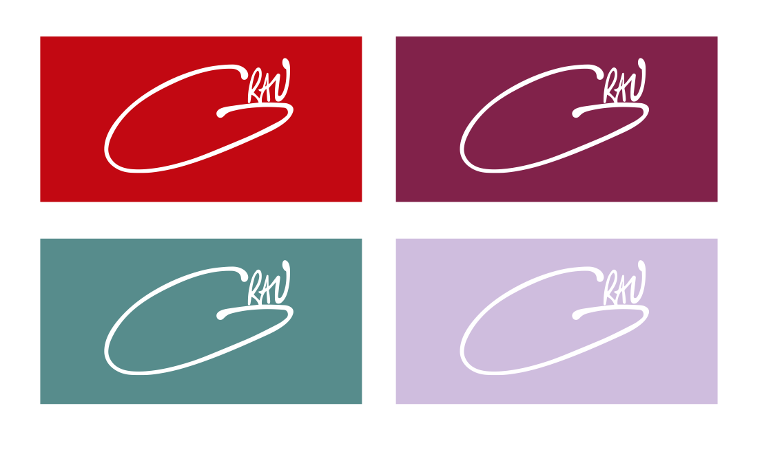
GRAU is a Panamanian fashion brand dear to my heart since we both came of age during the early 2010s. A decade later, the woman who wears the brand has grown up. And so, a refresh of the brand visual ID was designed.


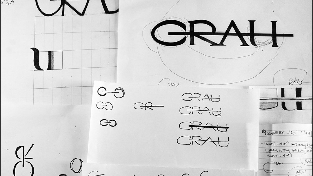
At first, I focused on a very angled design using a Garamond serif as the foundation, which I then altered manually; I love to mix digital and analogue with a scanner.
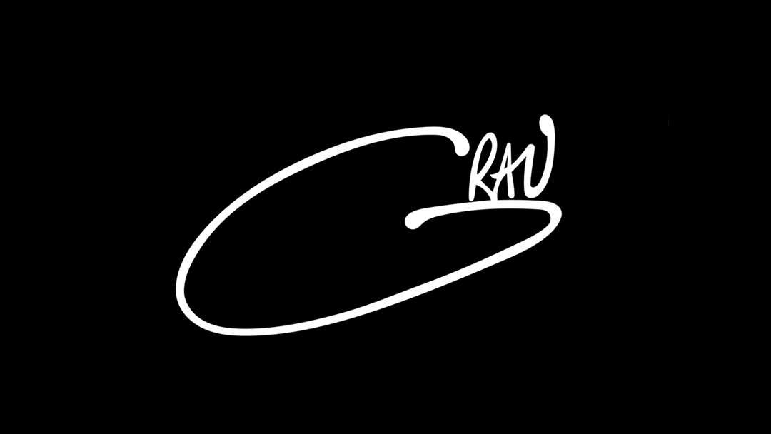
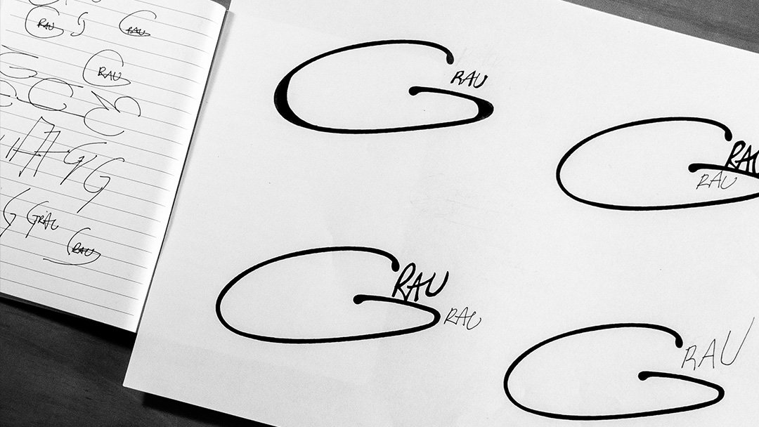
On our first follow-up meeting, the client commented on the design's Modern appeal and suggested something more spontaneous and effortless. It was then that I realized that a refresh of the original logo was the best way to proceed, my job was to translate the designer’s new, more mature approach to a logo that was originally was on her own handwritten signature.